Alternate NFL Logos
Tuesday, January 7, 2014
Minnesota Vikings
http://nflogos.com/post/20721168852/minnesota-vikings-2
Link Needed
http://forums.hoopshype.com/forums/index.php?topic=77750.0
http://www.footballasfootball.com/minnesota
http://www.footballasfootball.com/minnesota
http://www.dailynorseman.com/
http://www.ospreydawn.com/
Green Bay Packers
http://nflogos.com/post/25278245908/green-bay-packers
Link Needed
http://forums.hoopshype.com/forums/index.php?topic=77750.0
http://www.footballasfootball.com/green-bay
http://www.footballasfootball.com/green-bay
http://www.acmepackingcompany.com/
http://www.ospreydawn.com/
Chicago Bears
Link Needed
http://forums.hoopshype.com/forums/index.php?topic=77750.0
http://www.footballasfootball.com/chicago
http://www.footballasfootball.com/chicago
http://www.windycitygridiron.com/
http://www.ospreydawn.com/
http://nflogos.com/post/20041166649/chicago-bears
Monday, January 6, 2014
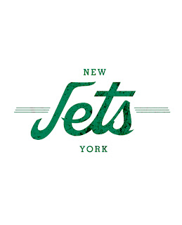
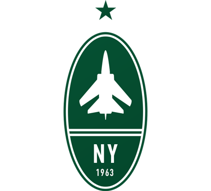
New York Jets
http://nflogos.com/post/20302307571/new-york-jets
http://forums.hoopshype.com/forums/index.php?topic=77750.0
Link Needed
http://www.sportsgrid.com/nfl/alternate-nfl-logos/
http://www.footballasfootball.com/ny-jets
http://www.footballasfootball.com/ny-jets
http://www.ganggreennation.com/
http://www.ospreydawn.com/
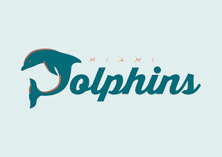
Miami Dolphins
Link Needed
http://forums.hoopshype.com/forums/index.php?topic=77750.0
Link Needed
http://www.sportsgrid.com/nfl/alternate-nfl-logos/
http://www.footballasfootball.com/miami
http://www.footballasfootball.com/miami
http://www.thephinsider.com/
http://www.ospreydawn.com/
Buffalo Bills
http://nflogos.com/post/32555316271/buffalo-bills-a-little-background-the-buffalo
http://www.sportsgrid.com/nfl/alternate-nfl-logos/
http://forums.hoopshype.com/forums/index.php?topic=77750.0
Link Needed
http://www.footballasfootball.com/buffalo
http://www.footballasfootball.com/buffalo
http://www.buffalorumblings.com/
http://www.ospreydawn.com/
Detroit Lions
http://nflogos.com/post/35963515994/detroit-lions
Link Needed
Link Needed
http://www.footballasfootball.com/detroit?s=b67
http://www.footballasfootball.com/detroit?s=b67
http://www.ospreydawn.com/
http://www.prideofdetroit.com/
Older Posts
Home
Subscribe to:
Posts (Atom)